

how i would've rebranded PrettyLittleThing

For today’s branding exercise, I’m looking into how I would’ve approached the recent rebrand of PrettyLittleThing. After 13 years of being the go-to fast fashion brand, PLT swapped out their infamous bright pink branding and unicorn mascot for a more minimalistic and sophisticated look. However, they’ve faced a lot of negativity after claims they prioritised an aesthetics update over a quality update. Anyways, here is how I would’ve done it!

THE VIBE:
For me, PLT was the ultimate choice for every British girl and her friends. Its success came from being accessible and affordable, with everyone you knew owning something from them in their wardrobe. I think people are struggling to love the rebrand as it feels worlds away from the PLT that we all grew up loving; it’s a lot more conservative with a lot less colour- and at a higher price point.
So, if I was to rebrand PLT, I would capitalise and celebrate the fun, feminine energy that has been a defining element of the brand for years.
THE MISSION:
I want PLT to be more than just about the clothes you wear; it should reflect a way of living. The brand has created a certain ‘girlhood’ energy, and the clothing needs to fit into that world. It’s about capturing a spirit of freedom and purpose, where dressing up becomes a part of embracing moments of fun, spontaneity, and togetherness. The pieces will feel like part of a larger, effortless lifestyle- one where enjoyment and simplicity come first. PLT won’t be about just buying clothes, but about being present, dancing until dawn, laughing with friends, and living in the moment. It will remain affordable and accessible, as the PLT girl’s money should be spent on cocktails and disco- not beige 100% polyester clothing.
BRANDING

I would pay homage to PLT’s iconic pink palette by running a subtle baby pink throughout the branding. PLT is so synonymous with the colour pink that it feels like a natural choice, and it fits with the feminine, 'girlhood' energy of the rebrand.
This could be achieved through heroing pink items in campaigns, set design, makeup choices etc. Another idea could be through social graphics/text. I love the above example of Réalisation- this would be good for PLT as my rebrand aims to get creative with brand education, so that the customer learns more about the new PLT and the values behind it. For example, the above graphic could be filled out by the PLT girl. Who is she? What is she wearing? What party is she going to? The aim is to create a desirable persona that makes the PLT community want to get up and get out with their friends.
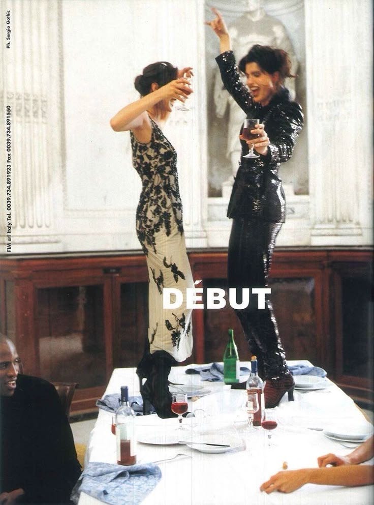
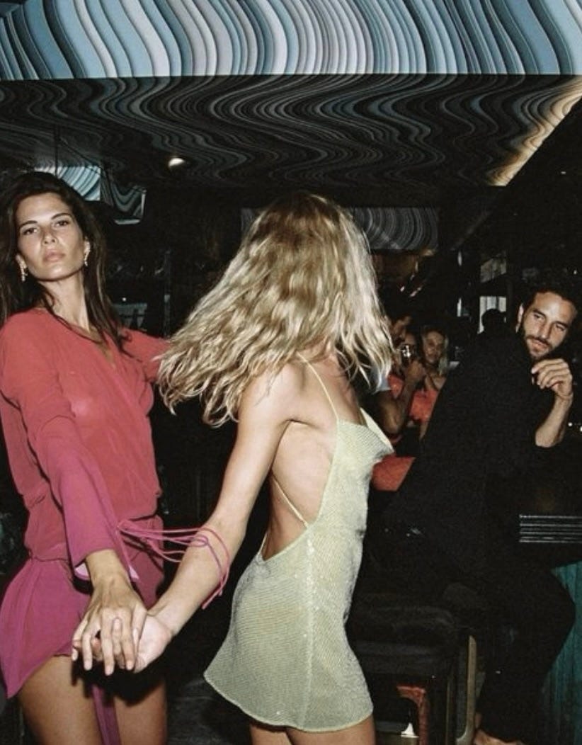
IMAGERY
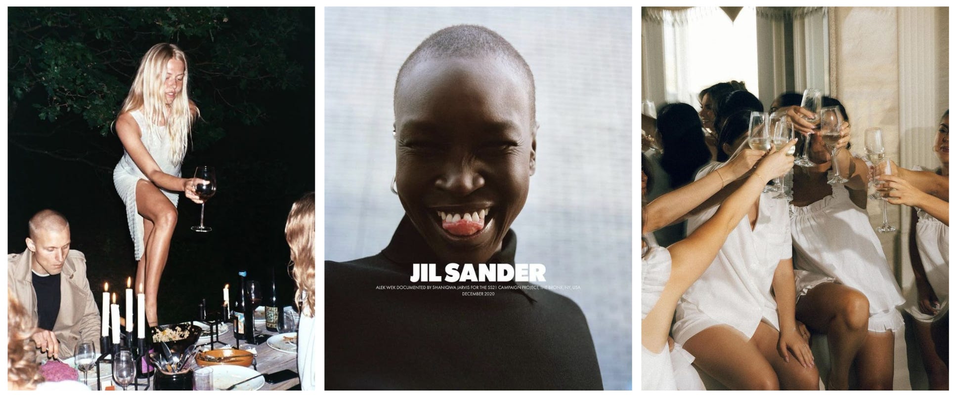
The PLT rebrand is all about living in the moment. The campaign imagery will let the experience speak for itself without the need to commercialise the clothes. I want the campaign visuals to come across as authentic – you can feel the happiness, movement and joy through the images. Most images will be shot candidly, with no retouching, to align with the new brand mission that PLT is more than just about the clothes you wear; it’s about the experiences you have wearing them.
I feel like the supporting ecomm/ product imagery could be more elevated too. It could feel more rich by being shot completely on film.
ECOMM:

With the rebrand, PLT would move away from traditional web design and go for a more elevated look with their ecomm imagery. For example, I love Zara’s website. Their use of full-bleed imagery makes me feel like I’m shopping something more special and almost more fulfilling, like flicking through an issue Vogue magazine.
I think PLT’s product and ecomm imagery could definitely be more elevated too. It could feel even more premium if shot entirely on film, capturing a sense of richness and authenticity that would elevate the overall brand experience.
FINAL THOUGHTS:
I could go on about potential brand collaborations and events (because what would a 2025 campaign be without including a brand’s community?!) but for now I’ll leave it here! I had so much fun doing this!
The key takeaway of this rebrand is that PLT remain the go-to for a girls night out. It’s fun and fresh and gives a middle finger to the current shift to more conservative fashion- who tf wants to go to a bottomless brunch in an office siren suit?
THANKU <3333
*Note: This is a completely fictional project! I envisioned how I might approach the recent PLT rebrand. All the imagery was curated to align with my strategy and vision. No hate to PLT’s rebrand- this is simply a creative branding exercise*
I love this!! This just proves that you can still rebrand towards being more elevated without compromising what makes the brand fun!
ohhhh this is great!!!! i'm currently writing an article on the shift in the fashion world and plt's direction was soooo shocking, idk why i thought they would be the last brand to do that.